Getting Your Brand’s Message Across
3 Min Read By Calvin McNeely
Whether it’s mobile or static, there are some simple ways to maximize your ad’s potential
In this day and age, consumers are bombarded with advertisements from all angles. Whether it’s scrolling through our Facebook feed or driving down the highway, we are all on information overload. For brands looking to get a message to a target audience, it’s important to understand how to create an ad that stands out from the rest.
Ads come in all shapes and sizes — mobile, digital, static and more — but regardless of the platform, below are some simple design tips to maximize your ad’s potential.
Make Your Message Clear and Concise
When it comes to copy in advertisements, less is more. Keep the message short and simple, and don’t clutter the ad with multiple calls to action. Like the message itself, the call to action should be clear. If you want your audience to reach out via phone, then put the number to call in the ad. If you want your audience to go online, then use the URL they need to visit.
Utilize Large and Powerful Imagery
Since our brains are programmed to associate images with specific information, selecting the right image to accompany your text is critical. Focus on one subject that’s large, easily seen, and relates directly to the text. This will grab and hold your audience’s attention and ultimately help them retain your message.
Keep Your Branding Consistent
Statistics show we tend to buy from the brands we know and trust. Almost every brand has a logo, but true “branding” extends beyond that. Your logo, color scheme, typography and tone of voice are all equally important factors in your branding. Create style guidelines to ensure that your branding is consistent across all marketing collateral.
Use Bold and Easy-to-Read Fonts
Bold, sans-serif font styles like Arial in larger font sizes allow for the highest readability in a billboard’s design To increase legibility, keep kerning and leading in mind. The more Kerning means breathing room between letters: K E R N I N G and Leading is space between lines of text in a sentence or paragraph. Make sure to always adhere to these readability guidelines.
Aim for Bold Contrast
For high readability, there needs to be enough contrast between your background and key message. Make sure that the logo, heading and call to action are easily readable within seconds, and pop against your background.
Visually Balance the Elements
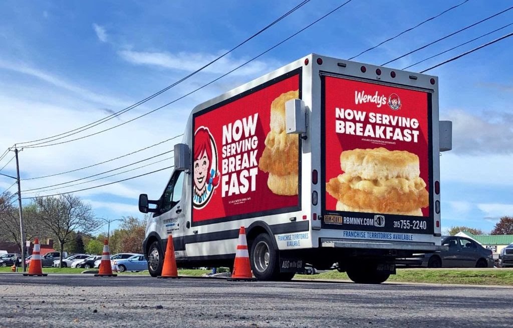
Every element has a “weight,” but they’re not all the same, and some can appear “heavier” than others. Wendy’s does a great job of capturing its audience's attention in a well-balanced way. For example, one of their digital ads is a photo of their breakfast sandwich occupying the right, which is matched by a large logo to the left, all atop their striking, highly recognizable red brand color. On the back, the large picture of their breakfast sandwich at the bottom is balanced by the logo and text filling the remaining space.
Give Readers a Clear Path
We, as humans, like a path to follow. Be sure to arrange and scale your elements in the order of importance to guide readers down the path created for them.
Leave Some Breathing Room
Appropriate use of white space allows elements to breathe. Make sure to allow for white space to help avoid overcrowding.
It takes customers about seven times hearing or seeing your ad before they take action. To accelerate the process, your message and brand should be used consistently across all collateral. These tips will help your billboard be more effective in reaching your target audience, as well as help in developing brand consistency.